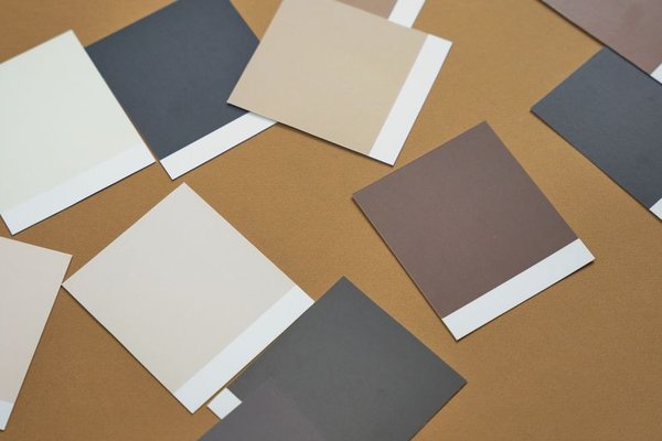
For the best part of a decade, UK homeowners have been loyal to cool greys. Dulux Grey, Skimming Stone lookalikes, icy whites with a blue undertone – it’s been the safe, scroll-stopping choice on every renovation account. But walk into any newly finished home this year and something has shifted. The grey is warming up, and it’s not going back.
2026 belongs to the warm neutral colour palette: layered beiges, soft taupes, and off-whites with a hint of cream rather than a hint of ice. It’s a shift that feels less like a trend and more like a correction – a return to interiors that feel lived-in, cosy and quietly expensive rather than clinical. If you’re planning a refresh this year, here’s what’s actually working, and how to put it together in your own home.
Why UK Homes Are Moving Away from Cool Greys
Cool greys had their moment because they were easy. They matched anything, photographed well, and felt “safe” for resale value. But years of grey-on-grey schemes left a lot of homes feeling a bit flat and impersonal – more show home than family home.
Warm neutral home decor is the answer to that fatigue. Instead of stark contrast, 2026 interiors are built on tonal layering – several shades of the same warm family sitting close together, so the eye moves gently around a room instead of hitting hard edges. It’s a softer, more forgiving look, and it happens to suit the UK’s grey skies far better than a cold undertone ever did.
The Building Blocks of a Warm Neutral Palette
A good warm neutral scheme usually pulls from three families, used together rather than in isolation.
Beige, But Not the 1990s Kind
Beige has been rehabilitated. This isn’t the yellow-heavy magnolia of decades past – it’s a more sophisticated, slightly greige-adjacent beige with warmth but restraint. It works beautifully as a wall colour precisely because it doesn’t compete with furniture or artwork.
Taupe for Depth and Grounding
Taupe interior colours are doing a lot of the heavy lifting in 2026 schemes. Sitting between brown and grey with a warm cast, taupe is what stops a beige room from feeling washed out. It’s especially effective on joinery, skirting, and larger furniture pieces like sofas, where it adds weight without darkening a space the way charcoal or navy would.
Off-White for Light and Lift
Off-white paint schemes are replacing brilliant white as the go-to for trim, ceilings and woodwork. A true white next to a warm beige wall can look jarring – too blue, too clinical. A cream-based off-white keeps everything in the same warm family, so trims and walls feel connected rather than clashing.
Beige Living Room Ideas That Actually Work
The living room is where most people start, and it’s also where warm neutrals earn their keep, because it’s the room that needs to feel relaxed rather than styled.
A simple, reliable formula: beige walls, a taupe sofa or taupe curtains, and off-white trim and ceiling. Then bring in texture rather than colour to add interest – a boucle armchair, a jute rug, linen cushions, unlacquered brass or aged wood accents. The palette stays quiet; the materials do the talking.
For smaller living rooms, keep the beige on the lighter side and reserve taupe for one or two anchor pieces, such as curtains or a single feature wall behind a sofa. This stops the room feeling boxed in while still giving it that warm, grounded 2026 look.
Taking It Through the Rest of the Home
One of the reasons this palette has taken off is how well it travels between rooms without needing a hard reset at every doorway.
In kitchens, warm neutrals are showing up on cabinetry as much as walls – think a taupe or warm stone-coloured shaker unit paired with off-white walls and brushed brass hardware. In bedrooms, the same beige-taupe-off-white trio creates a genuinely restful feel, especially when layered through bedding, curtains and a wool rug rather than paint alone.
Hallways and stairwells benefit particularly well from off-white paint schemes, since these are often north-facing or low-light spaces where a cooler white can look grey and uninviting. A warmer off-white keeps these transitional spaces feeling bright without the chill.
Pairing Warm Neutrals With Colour and Texture
A palette this quiet needs a little contrast to stop it feeling flat, and 2026 schemes are leaning on two things to do that: texture and small, considered hits of colour.
Texture-wise, natural materials are doing most of the work – rattan, linen, boucle, unpolished stone, and warm-toned wood like oak or walnut. These all sit comfortably within a warm neutral home decor scheme because they share the same undertone rather than fighting it.
For colour, the trend isn’t bold accent walls but small, saturated moments – a terracotta vase, an olive green cushion, a rust-coloured throw. These earthy tones sit naturally alongside beige and taupe because they share the same warm base, unlike jewel tones or cool blues, which can feel like they belong to a different scheme entirely.
Choosing the Right Undertone Before You Buy Paint
The most common mistake with warm neutrals is buying a tester pot without checking the undertone in your own light. A beige that looks warm and inviting in a south-facing showroom can turn pink or dirty-looking in a north-facing UK room with limited natural light.
Always test a sample on the actual wall, not just a paint chart, and look at it at different times of day – morning light, midday, and evening with the lamps on. It’s a small step, but it’s the difference between a warm neutral palette that feels considered and one that feels like a mistake.
Frequently Asked Questions
What is a warm neutral colour palette?
A warm neutral colour palette is a scheme built around shades like beige, taupe and off-white that all carry a warm, yellow or red-based undertone rather than a cool, blue-grey one. The result is a softer, cosier feel than the grey-dominated palettes popular over the last decade.
Is beige coming back in 2026?
Yes. Beige is back, but in a more refined form than in previous decades. Rather than a flat, yellow-heavy beige, 2026’s version leans slightly greige and is almost always layered with taupe and off-white tones rather than used on its own.
What colours go with a warm neutral palette?
Earthy, warm-toned accents work best, including terracotta, olive green, rust and warm browns. Materials like rattan, linen and warm wood also complement warm neutral home decor, since they share the same underlying warmth rather than introducing a cool contrast.
How do I stop a beige room looking dull?
Layer in texture through rugs, cushions, curtains and natural materials, and vary the tone slightly between walls, furniture and trim rather than using one flat shade throughout. A small pop of an earthy accent colour also helps lift the space without breaking the warm neutral feel.
Final Thoughts
Warm neutrals aren’t a dramatic reinvention of the British home – they’re a gentler, more comfortable evolution of what’s come before. By pairing beige, taupe and off-white with natural texture and a few earthy accents, it’s possible to create a space that feels current in 2026 without dating quickly once the next trend arrives. If cool grey has started to feel a little tired in your own home, this is the easiest, lowest-risk way to warm things up.