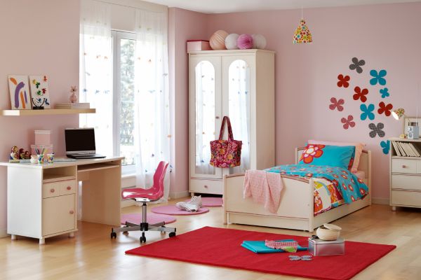
Choosing colors for a child’s bedroom can feel surprisingly complicated. What begins as a simple decision between blue, green, pink, or yellow often turns into questions about mood, age, lighting, furniture, and how quickly a child’s preferences might change.
A kids bedroom has to do several jobs at once. It may be a place for sleeping, reading, playing, studying, building elaborate blanket forts, and storing an impressive collection of toys. The colors need to support all of these activities without making the room feel chaotic or overly serious.
The most successful color schemes for kids bedrooms usually balance personality with flexibility. They feel cheerful enough for childhood but adaptable enough to survive changing interests, new furniture, and the occasional request for an entirely different theme.
Start With the Feeling of the Room
Before looking at paint samples, consider how the room should feel.
Some children need a calm retreat at the end of a busy day. Others enjoy a bright, energetic environment filled with color and movement. A small bedroom may benefit from a light, airy palette, while a larger room can comfortably handle deeper shades.
It also helps to think about when the room is used most. Warm colors may make a north-facing space feel more welcoming, while cooler tones can bring balance to a room that receives strong afternoon sunlight.
Color should support the atmosphere rather than dominate it. A bedroom can still feel playful without every wall being painted in a vivid shade. In fact, quieter backgrounds often give toys, artwork, bedding, and books more room to stand out.
Soft Blue With Warm Natural Tones
Blue remains a popular bedroom color because it can feel peaceful without appearing dull. The key is choosing a shade that has softness and depth.
Powder blue, dusty blue, and muted sky tones work well with warm white, natural wood, woven baskets, and sandy beige. These combinations prevent the room from feeling cold. They also create a flexible base that can suit different ages.
A younger child’s room might include cloud-shaped cushions, colorful books, and patterned bedding. As the child grows, those details can be replaced with simple textiles, framed artwork, or darker navy accents without repainting the entire room.
This palette is especially useful in bedrooms that need to feel calm at bedtime. It has enough color to create character, yet it does not demand constant attention.
Sage Green for a Calm, Modern Look
Sage green has become a favorite in family interiors because it feels fresh, gentle, and easy to live with. It brings a hint of nature indoors without being as bold as emerald or forest green.
In a child’s room, sage can be paired with cream, soft gray, pale wood, or warm tan. The result feels relaxed and slightly earthy. It works beautifully with animal prints, botanical illustrations, nature-inspired toys, and simple striped fabrics.
Sage green is also one of the more adaptable color schemes for kids bedrooms. It can suit a nursery, an early school-age room, or a teenager’s space depending on the accessories around it.
For a little more energy, add touches of mustard, rust, or muted coral. These warmer accents stop the palette from becoming too quiet while maintaining a natural, balanced appearance.
Warm Neutrals With Playful Accents
Neutral does not have to mean plain. Warm ivory, oatmeal, soft beige, and light taupe can create a cozy background for brighter details.
This type of palette is useful when the room already contains colorful toys, books, or storage boxes. Rather than competing with those items, the walls provide visual breathing space.
The playful part can come through cushions, rugs, curtains, wall art, and painted furniture. A warm neutral room might include accents of tomato red, teal, sunshine yellow, or leaf green. Because these colors appear in smaller amounts, they are easier to change when a child develops new interests.
Warm neutrals are also practical for shared bedrooms. They provide a common foundation while allowing each child to personalize a bed, shelf, or study corner with a favorite color.
The room may look simple at first, but once personal objects are added, it rarely feels empty.
Peach, Coral, and Soft Pink Without the Sugariness
Pink bedrooms do not need to be overly sweet or themed. Dusty rose, muted peach, and soft coral can feel warm, modern, and full of personality.
These shades work well with cream, light brown, burgundy, pale green, or natural timber. The deeper supporting colors give the palette more dimension and prevent it from feeling one-note.
A peach wall paired with a patterned rug and wooden furniture can create a cheerful room without relying on traditional decorative choices. Likewise, dusty pink combined with olive green has a slightly vintage quality that can grow with a child.
For a more subtle result, use pink on one wall or through bedding rather than across the entire room. Sometimes a small amount of a strong color makes a greater impression than using it everywhere.
Yellow Used With a Lighter Touch
Yellow brings warmth and optimism, but it can become intense when used across every surface. Softer shades tend to work best in bedrooms.
Butter yellow, pale ochre, and muted mustard can add sunshine without making the room feel restless. They pair naturally with white, gray, blue, green, and warm wood.
Instead of painting all four walls yellow, consider using it on a reading nook, a headboard wall, or the inside of shelves. A yellow ceiling can also create a playful surprise while leaving the walls calm.
Yellow is particularly effective in rooms with limited natural light. It can make the space feel brighter on cloudy days and more welcoming during the evening.
The shade matters, though. Very sharp lemon tones may feel energetic, while warmer yellows create a softer and more comfortable effect.
Lavender and Lilac for Gentle Character
Lavender sits between warm and cool, which makes it surprisingly versatile. It can feel dreamy when combined with pale pink and cream, or more sophisticated when paired with gray, navy, and deep plum.
A light lilac wall works well in smaller bedrooms because it adds personality without closing in the space. It also complements many natural materials, including rattan, light oak, and linen.
To avoid making the room feel overly themed, use a mixture of textures and slightly different tones. Lavender curtains, a gray rug, white bedding, and one darker purple cushion can feel more layered than matching everything exactly.
This color family is a good choice for children who want something expressive but not extremely bright.
Earthy Terracotta and Desert-Inspired Shades
Terracotta, clay, sand, and muted rust bring warmth and depth to a child’s bedroom. These colors feel grounded and comfortable, especially when used with cream, soft green, or faded blue.
A terracotta feature wall can make a room feel cozy without becoming dark. It works particularly well with wooden furniture and handmade-looking textiles.
This palette can support many different styles. It may feel adventurous with maps and animal illustrations, relaxed with simple patterns, or artistic with colorful prints and craft displays.
Because earthy colors contain natural warmth, they tend to look welcoming in both daylight and artificial light. They also hide small marks more successfully than very pale paint, which is not an insignificant advantage in a child’s room.
Brighter Colors Without Visual Overload
Some children genuinely love bold color, and there is no need to talk them into beige. The challenge is creating energy without turning the room into a collection of competing shades.
A simple approach is to choose one strong color, one supporting color, and a quieter background. Cobalt blue might be paired with orange accents and warm white walls. Bright green could work with navy and pale gray. Red may feel more manageable when balanced with cream and natural wood.
Repeating the main colors in different areas helps the room feel intentional. A color from the rug might appear again in a cushion, picture frame, or desk lamp.
Bold colors often work best when they are given space. Large areas of neutral or soft color allow vivid details to feel exciting rather than exhausting.
Consider How the Palette Will Grow
Children’s interests can change quickly. A room designed entirely around one character, sport, or trend may feel outdated sooner than expected.
A more adaptable approach is to use long-lasting colors on walls and furniture, then bring current interests into the room through removable details. Posters, bedding, lampshades, cushions, and storage accessories are much easier to replace than flooring or built-in cabinetry.
This does not mean the room should feel adult or overly restrained. It simply means separating the permanent elements from the temporary ones.
When exploring color schemes for kids bedrooms, it is worth asking whether the palette can support several different versions of the room. A blue and cream space might move from an ocean theme to space exploration and later to a simple teenage bedroom. The foundation remains useful even as the story changes.
Let Children Have a Meaningful Choice
A child is more likely to enjoy the room when they feel included in creating it. Still, handing over an entire paint chart may be overwhelming.
A practical method is to narrow the options to a small group of suitable colors and let the child choose from them. They might select the main accent shade, the bedding, or the artwork rather than deciding every surface.
Children often make brave color choices that adults would avoid. Sometimes those choices bring exactly the freshness the room needs. The aim is not to control every decision, but to create enough structure that the final result remains comfortable and cohesive.
Even a small choice can give a child a sense of ownership over the space.
Creating a Room That Feels Personal
The best kids bedrooms rarely follow a formula perfectly. They develop through a mixture of thoughtful planning, favorite objects, family routines, and the child’s own changing personality.
Color provides the foundation, but it does not need to carry the entire design. A calm wall color can support bright toys and artwork, while a bold feature shade can bring life to simple furniture and neutral fabrics.
Successful color schemes for kids bedrooms feel playful without becoming overwhelming and practical without losing warmth. When the palette reflects both the child and the way the room is actually used, the space begins to feel natural. It becomes less like a decorated room and more like a small world of their own.